Zingo
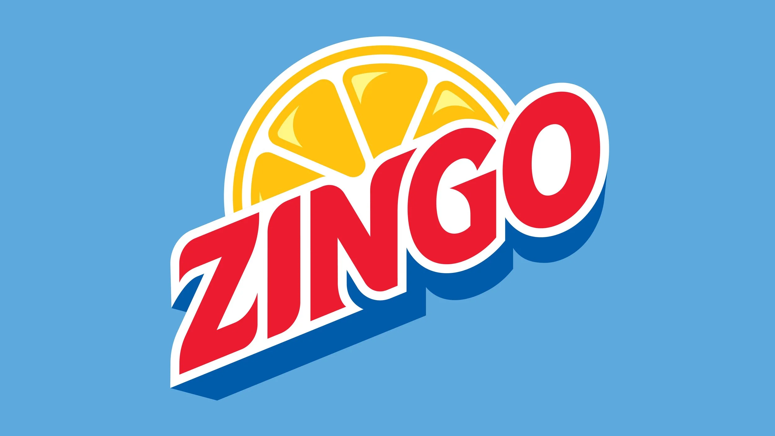
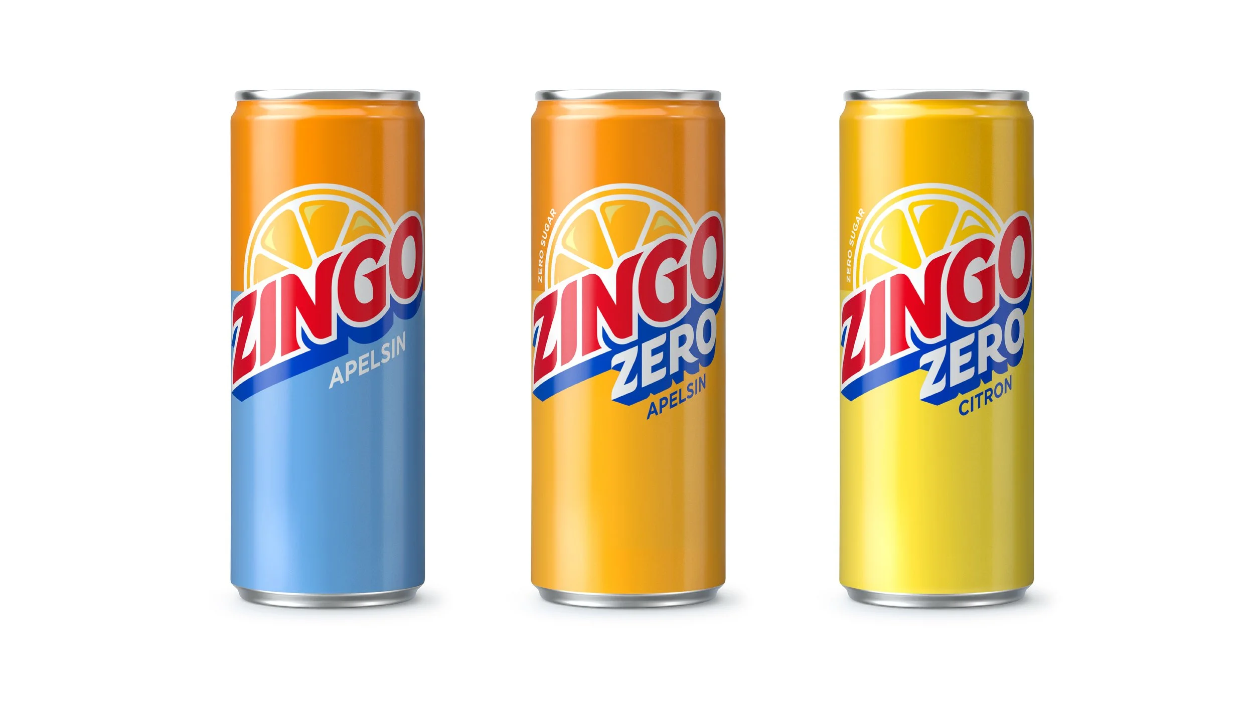
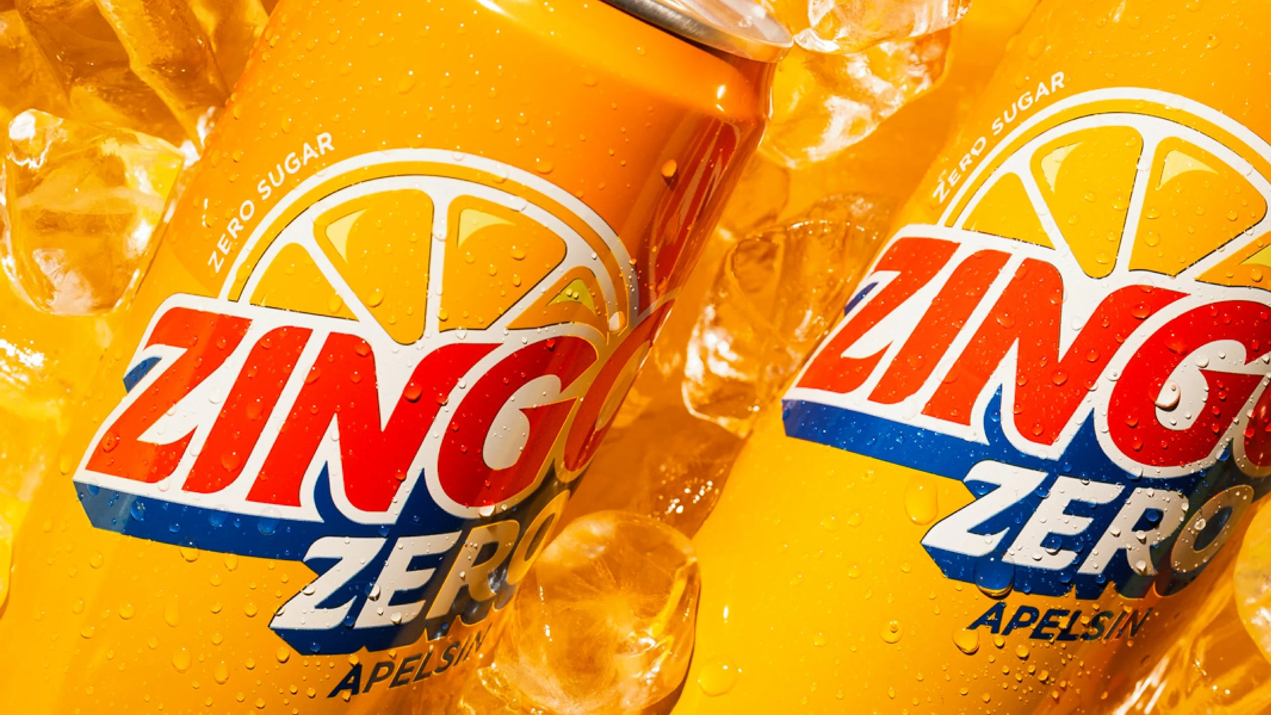
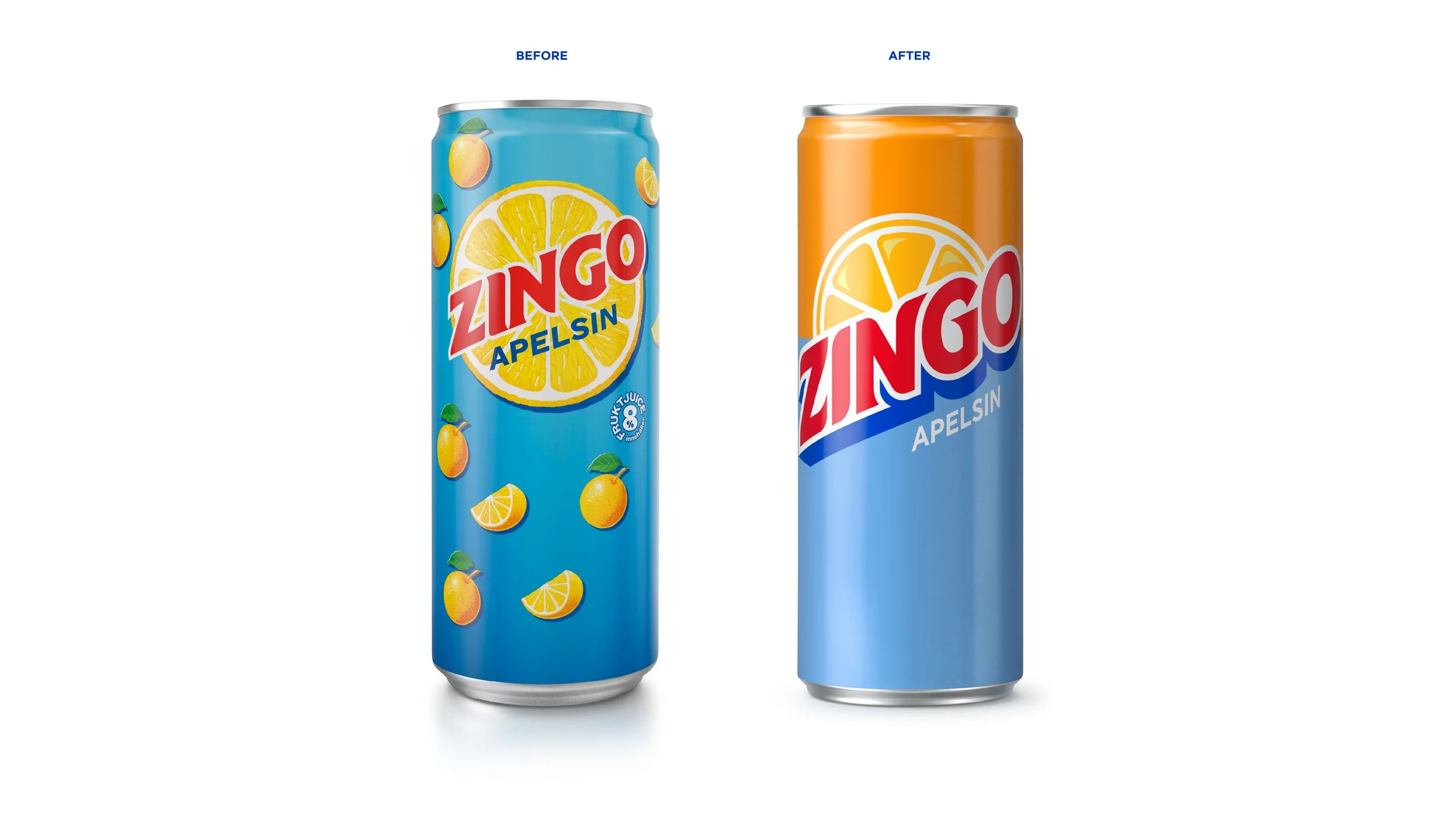
Zingo has been around as a fruity, local alternative to the big soda giants for as long as we can remember, consistently winning blind tests as tasting better. Now the Swedish challenger needed to step up its game to stand out on the shelf. So, how far can you move a Swedish hero who has “tasted of sunshine” for 70 years? At the heart of the brand sits a bold, graphic logo that brings clarity, energy and strong shelf presence. Its distinctive shape makes the product instantly recognisable, even from a distance, giving Zingo a powerful visual signature across packaging and communication.