Ramlösa
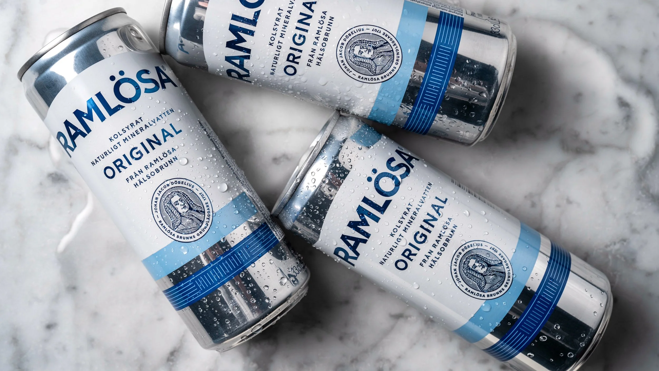
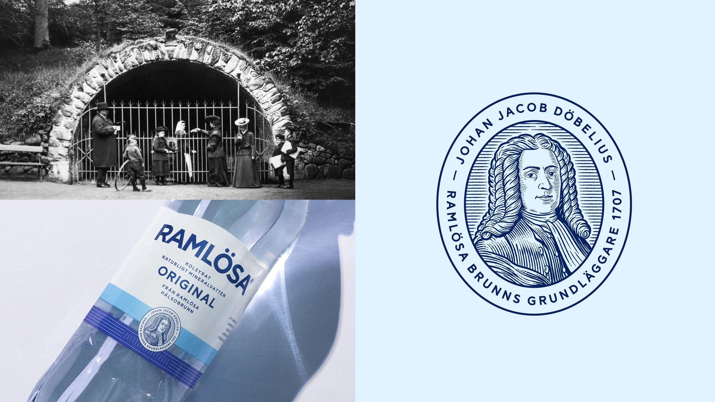
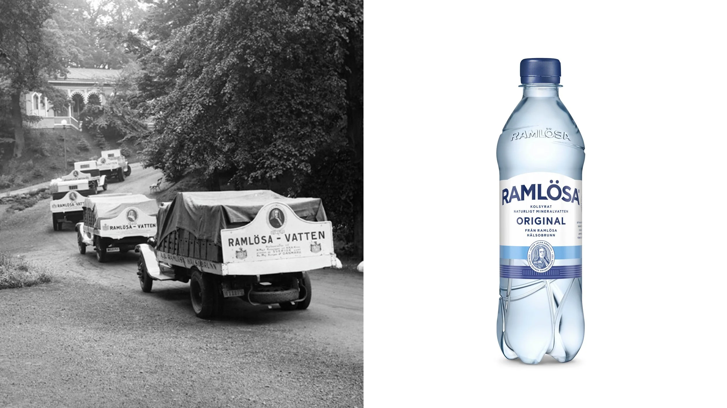
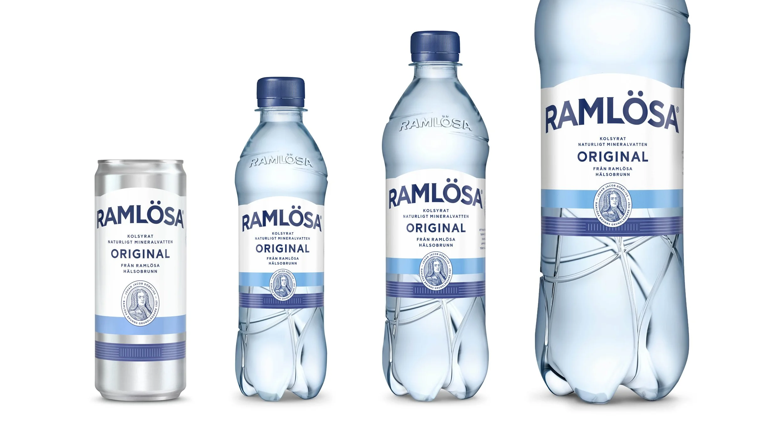
The redesign of Ramlösa is driven by equal parts curiosity for the future and respect for its heritage. Every element of the identity has been revisited. The logo has been redrawn, the iconic arch shape has been strengthened, and patterns from historic bottles have been brought back to life. A custom typeface was also created, inspired by Ramlösa’s long history.
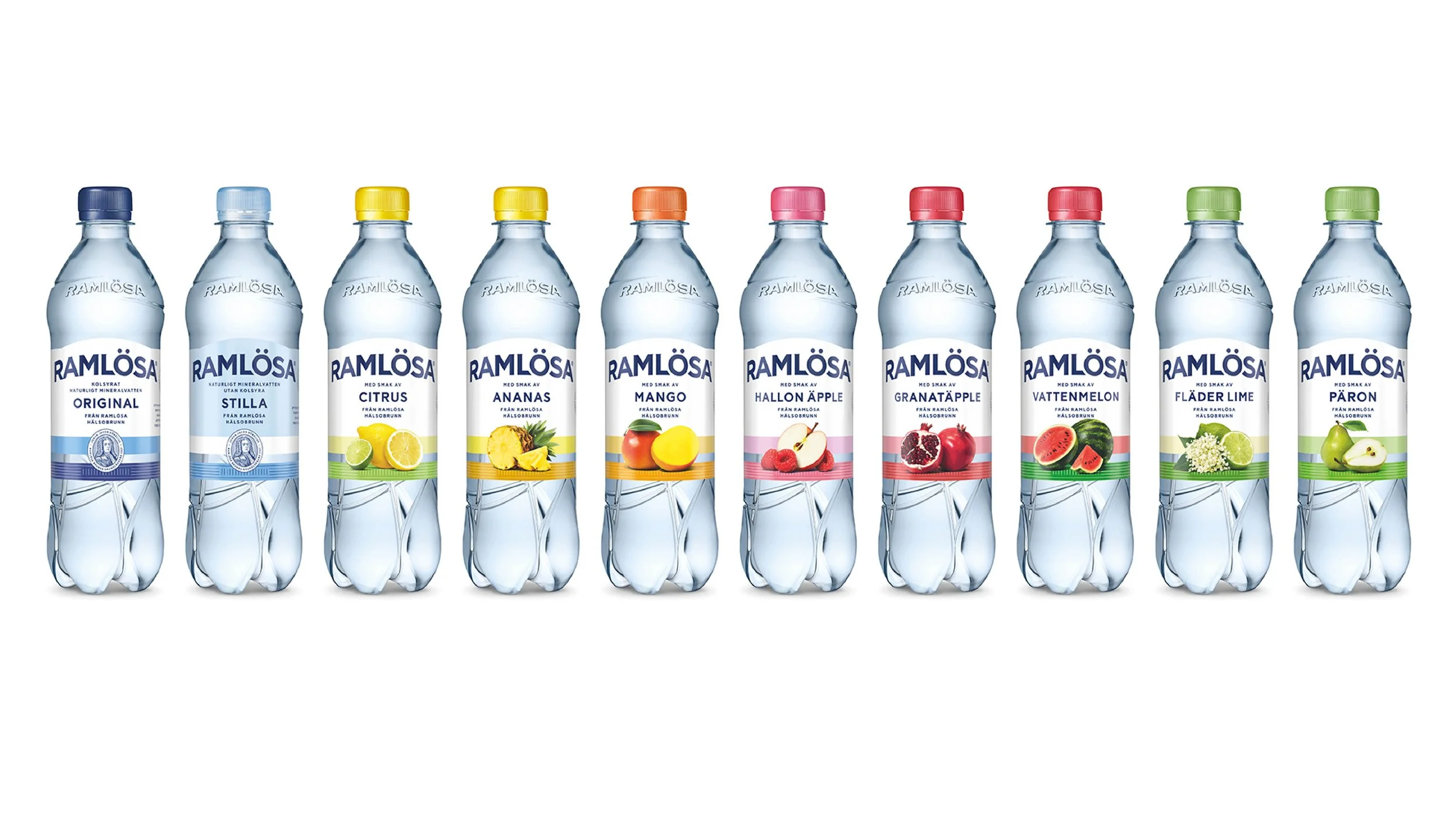
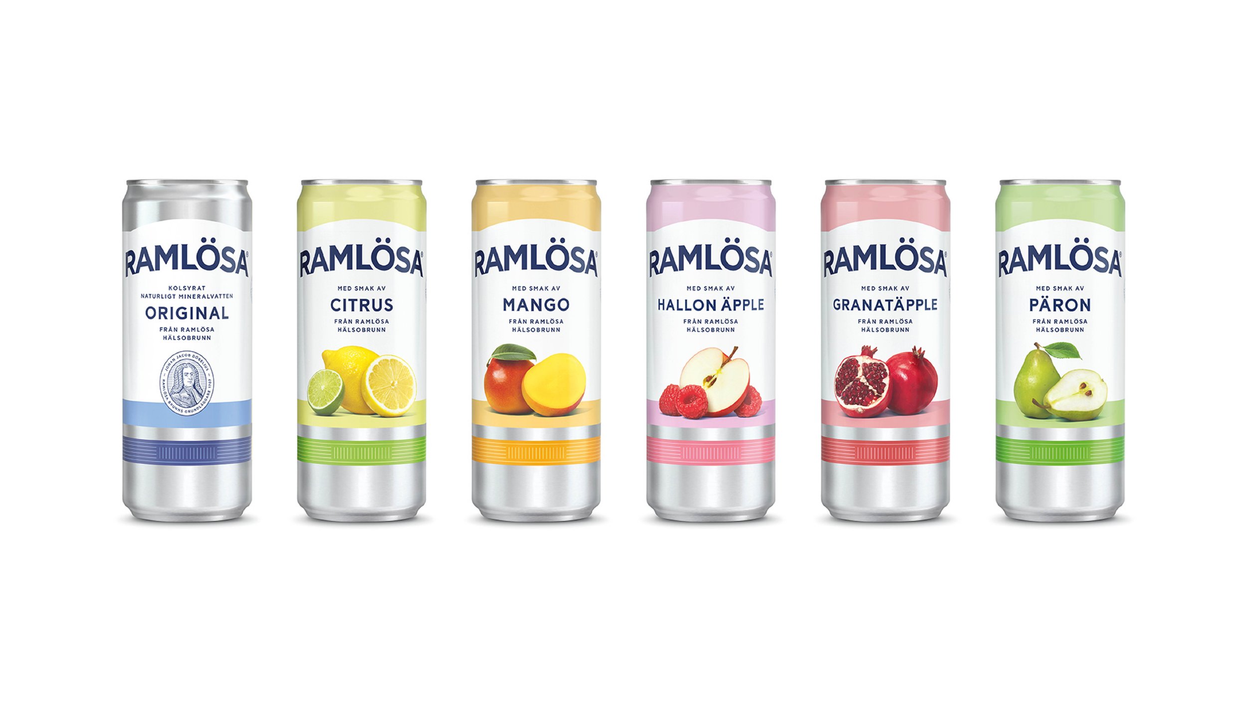
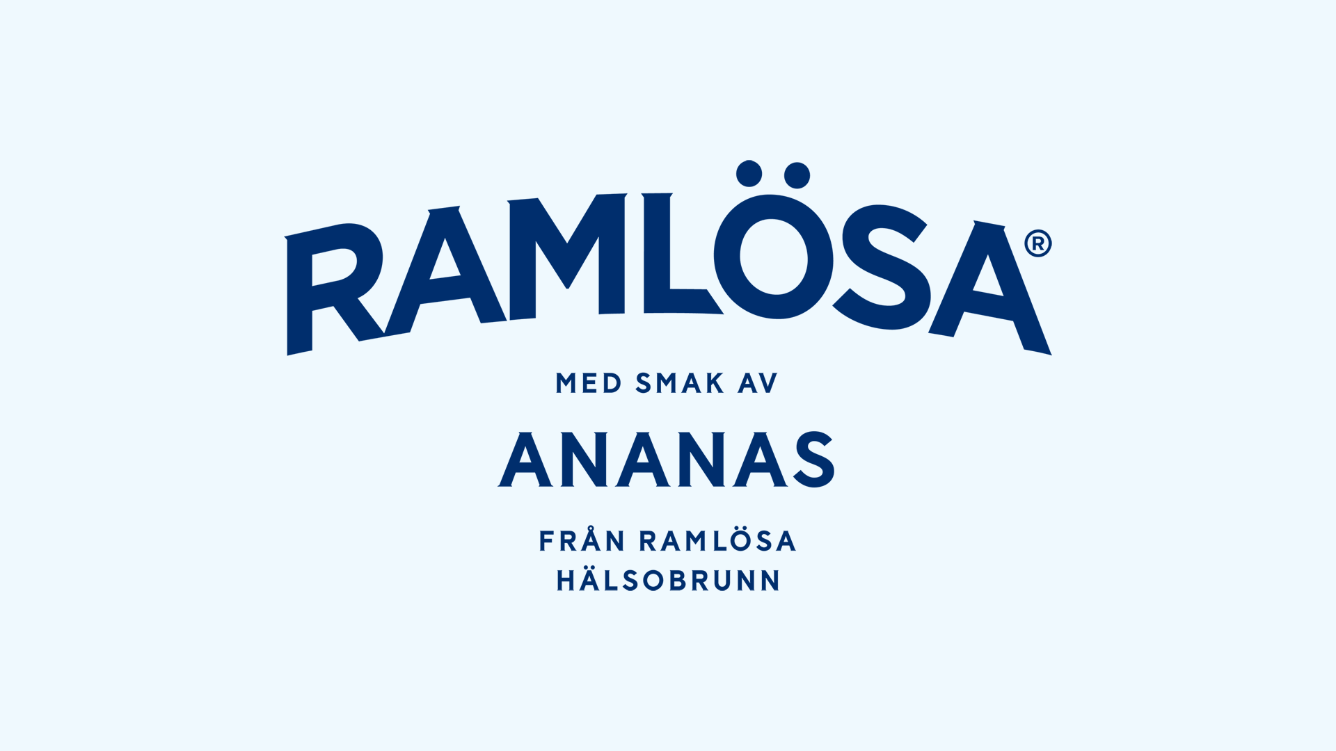
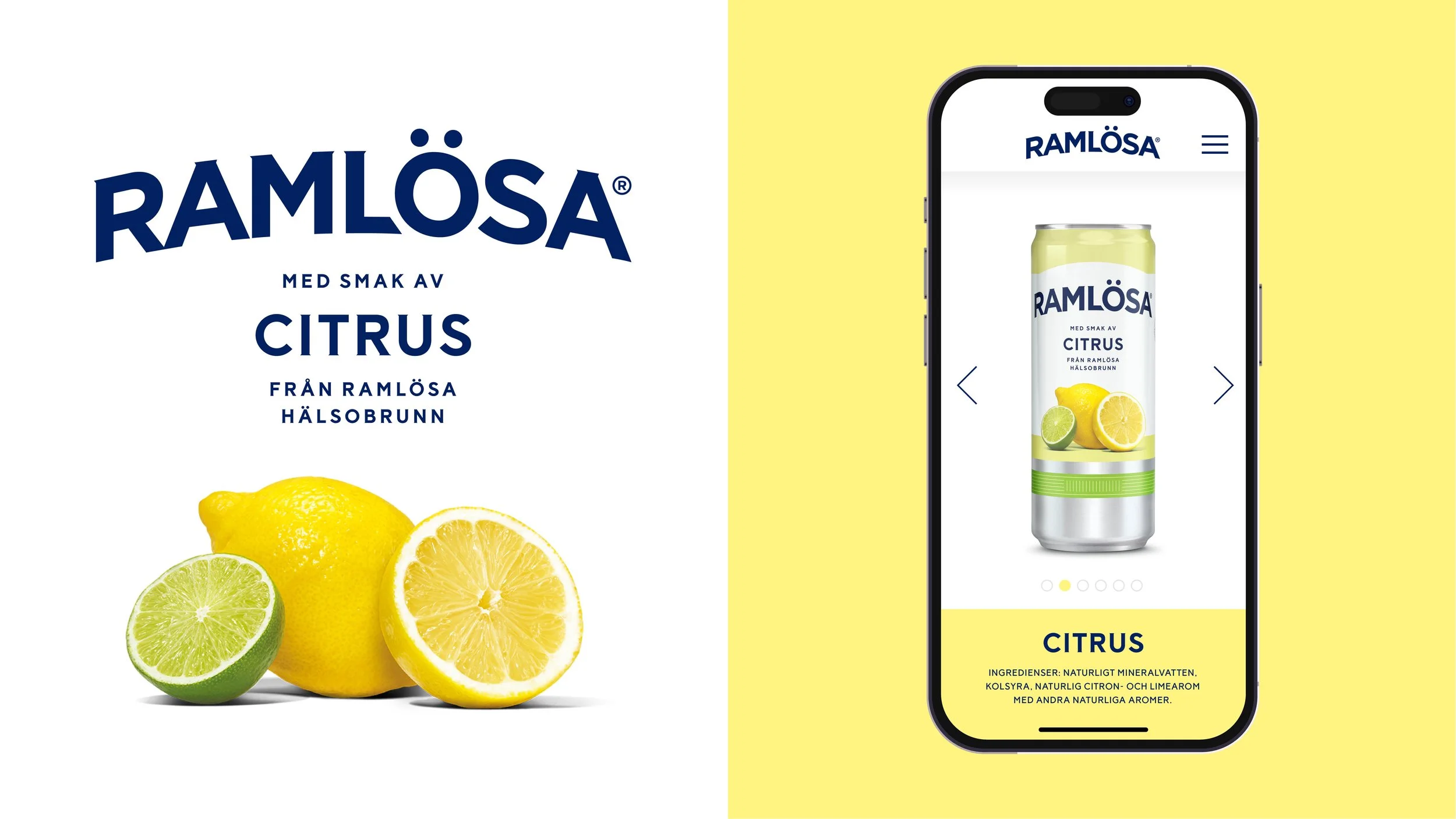
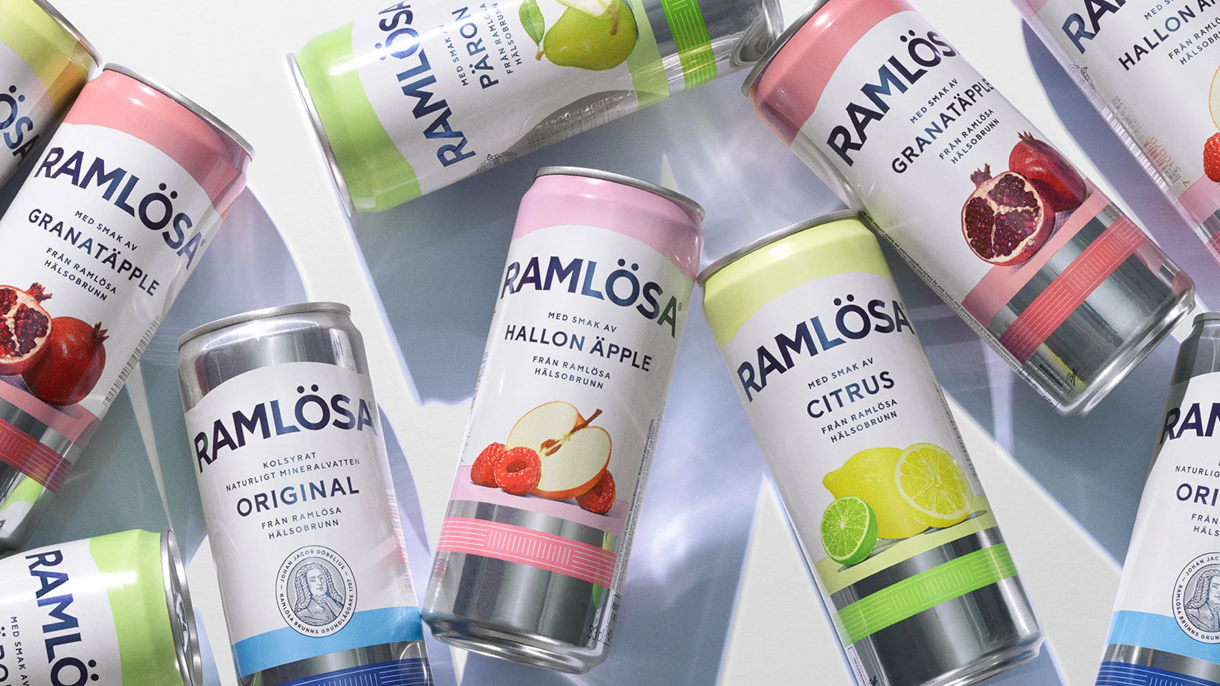
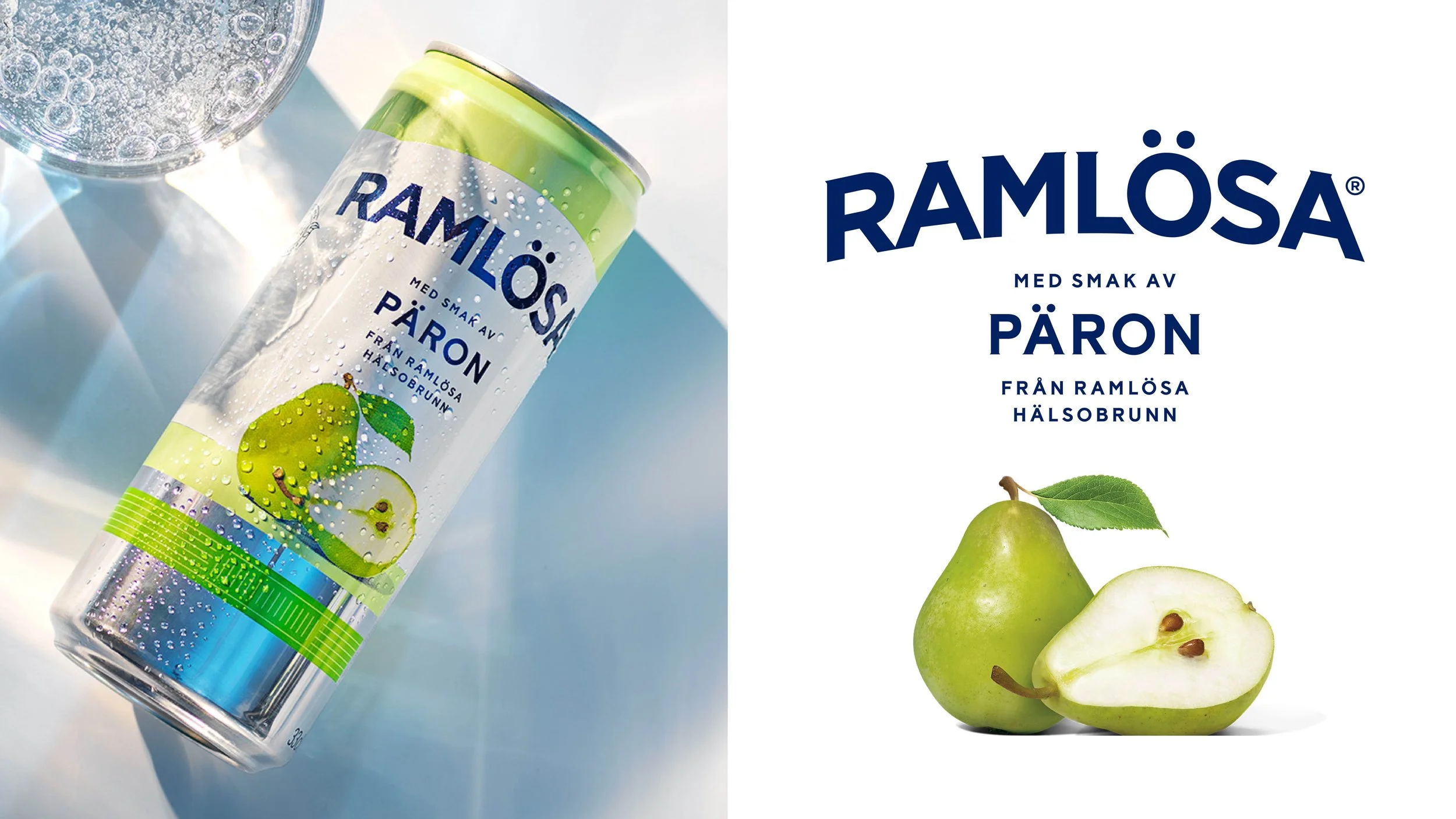
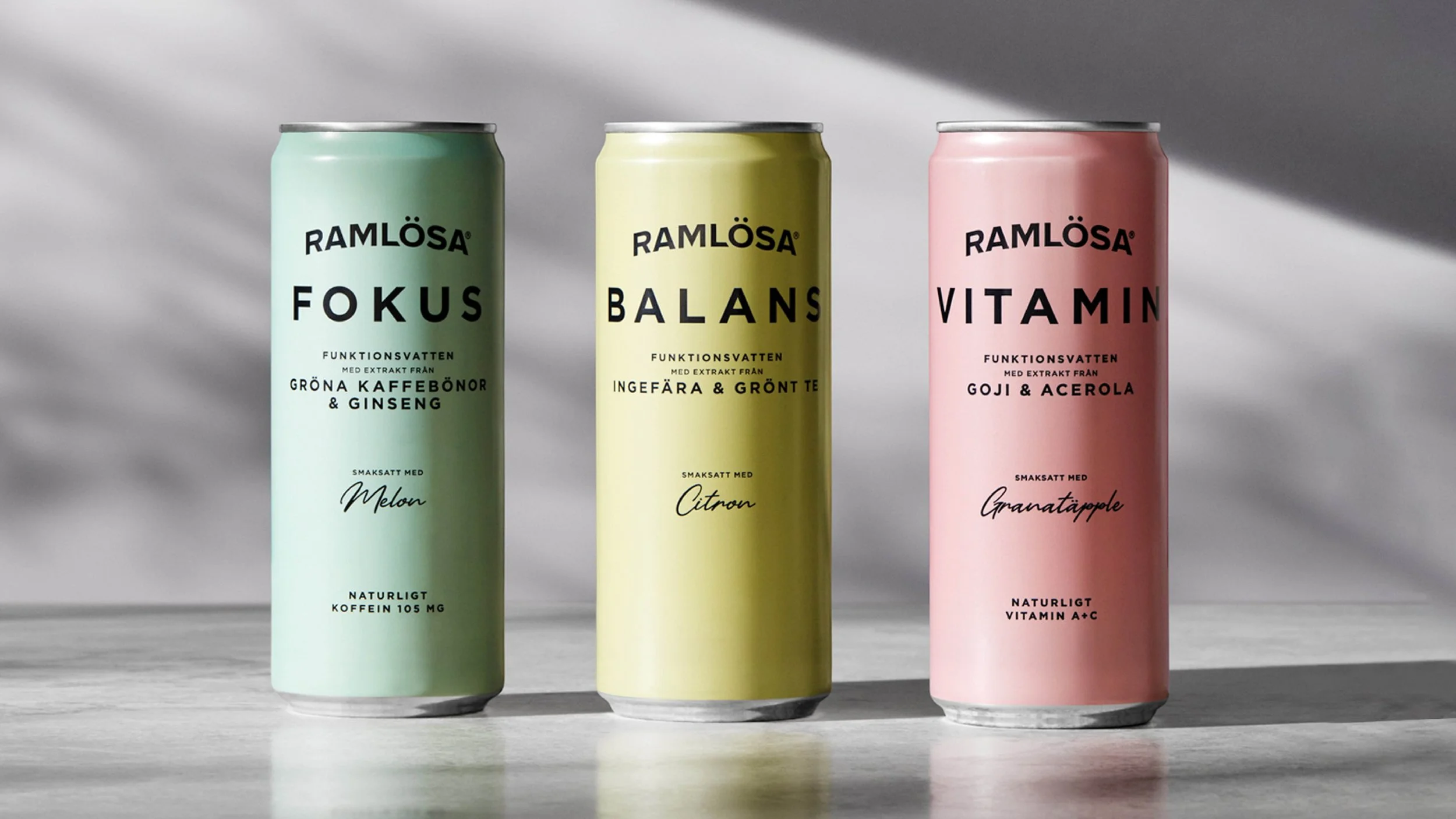
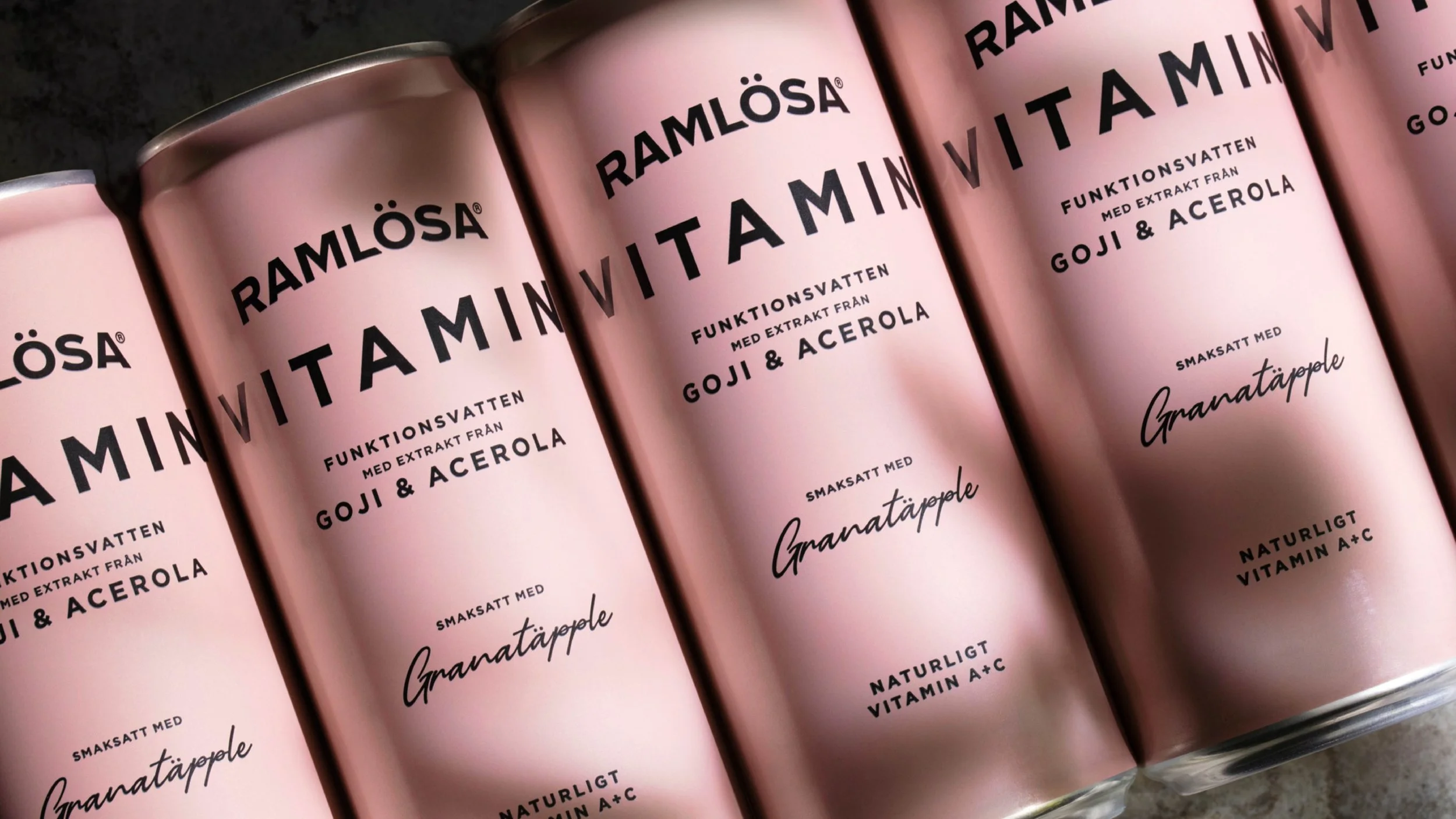
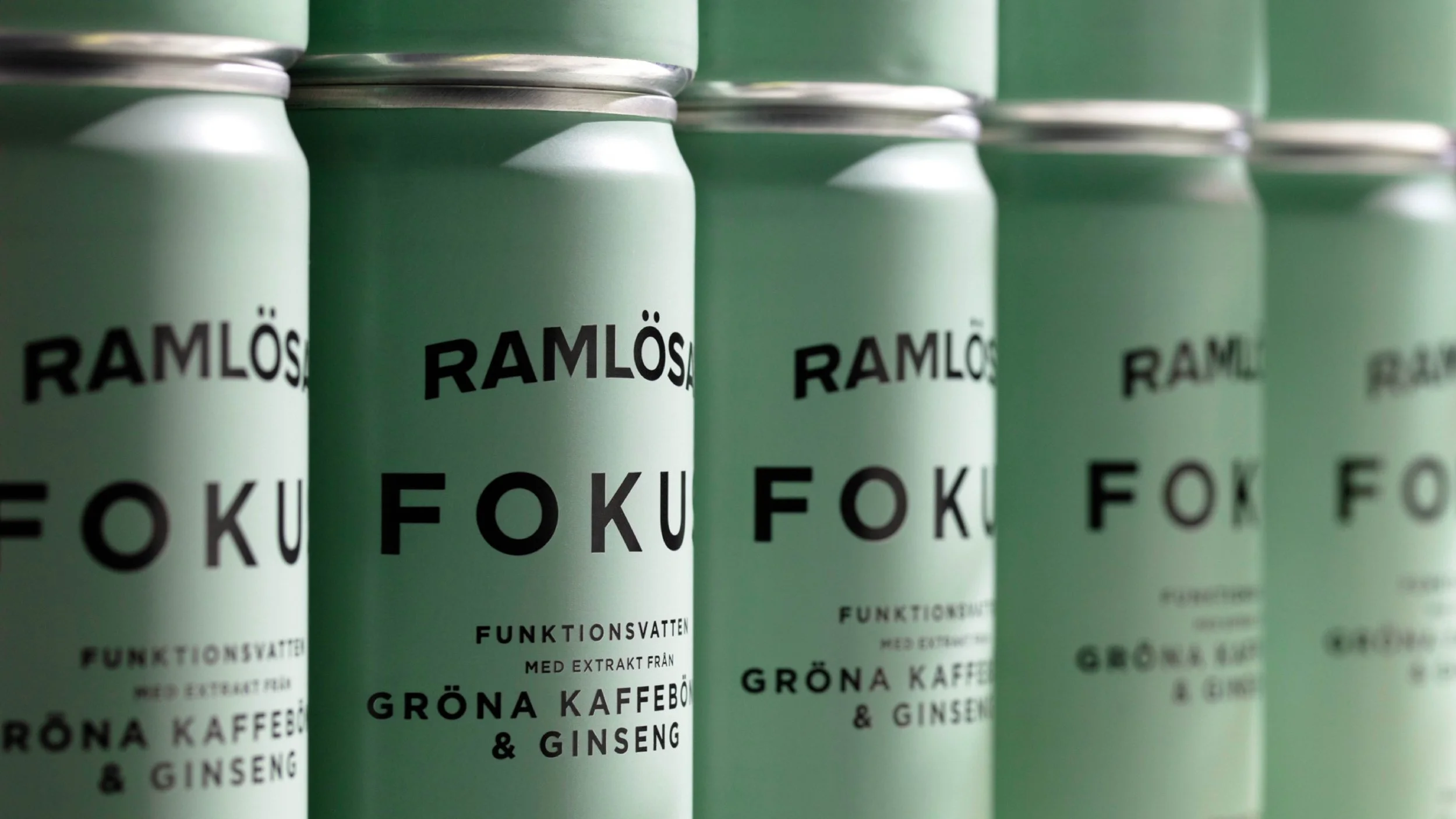
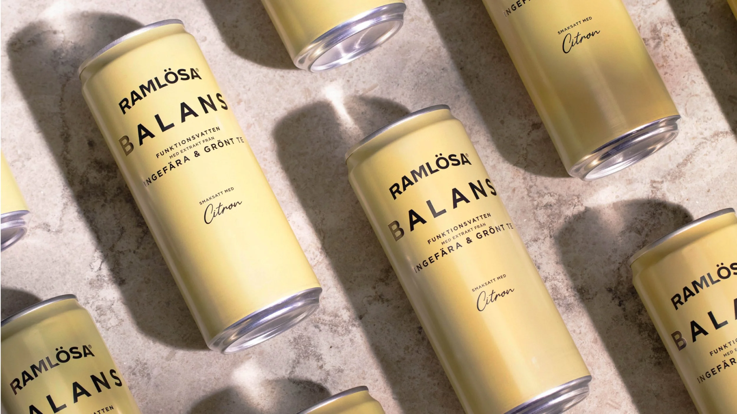
The Döbelius portrait has been reinterpreted with a new visual expression, while the flavours have been given greater prominence through an updated colour palette and a more unified photographic style. All of this was done with one clear ambition: to ensure that Ramlösa remains one of Sweden’s most iconic brands, standing strong and confident on shelf.
After having provided Swedes with natural mineral water for hundreds of years, the time had also come for Ramlösa to broaden their offering. A fresh newcomer fit for a functional lifestyle. A packaging design that speaks functionality, yet still contemporary and classic.